This was probably the shortest deadline I worked in : 2 and a half days. A Record.
And in that crazy short time I and my team of four amazing people, did a lot of visual and print design, edited a corporate presentation video and restructured a website to better welcome Redeem Médical clients.
But who is Redeem Médical? They're a small business aiming at reproposing medical material such as splints, crotches and co. The problem is that with recent regulations they can't do a lot but build their material collection system, a system of collection points established in pharmacies, doctors waiting rooms ...
Here's were their key problem came to us : Redeem Médical general communication and website spoke to medical professionals, without selling their solution, and presenting the collection points to other individuals, in a hidden page.
In short :
- Medical professional comes to website. Learns of the project. Contact them? Get out of website
- Individual comes to website. Finds a lot of info on project. Searches and finds collection points? Gets out of website
So yes we worked on that.
Here's the result !
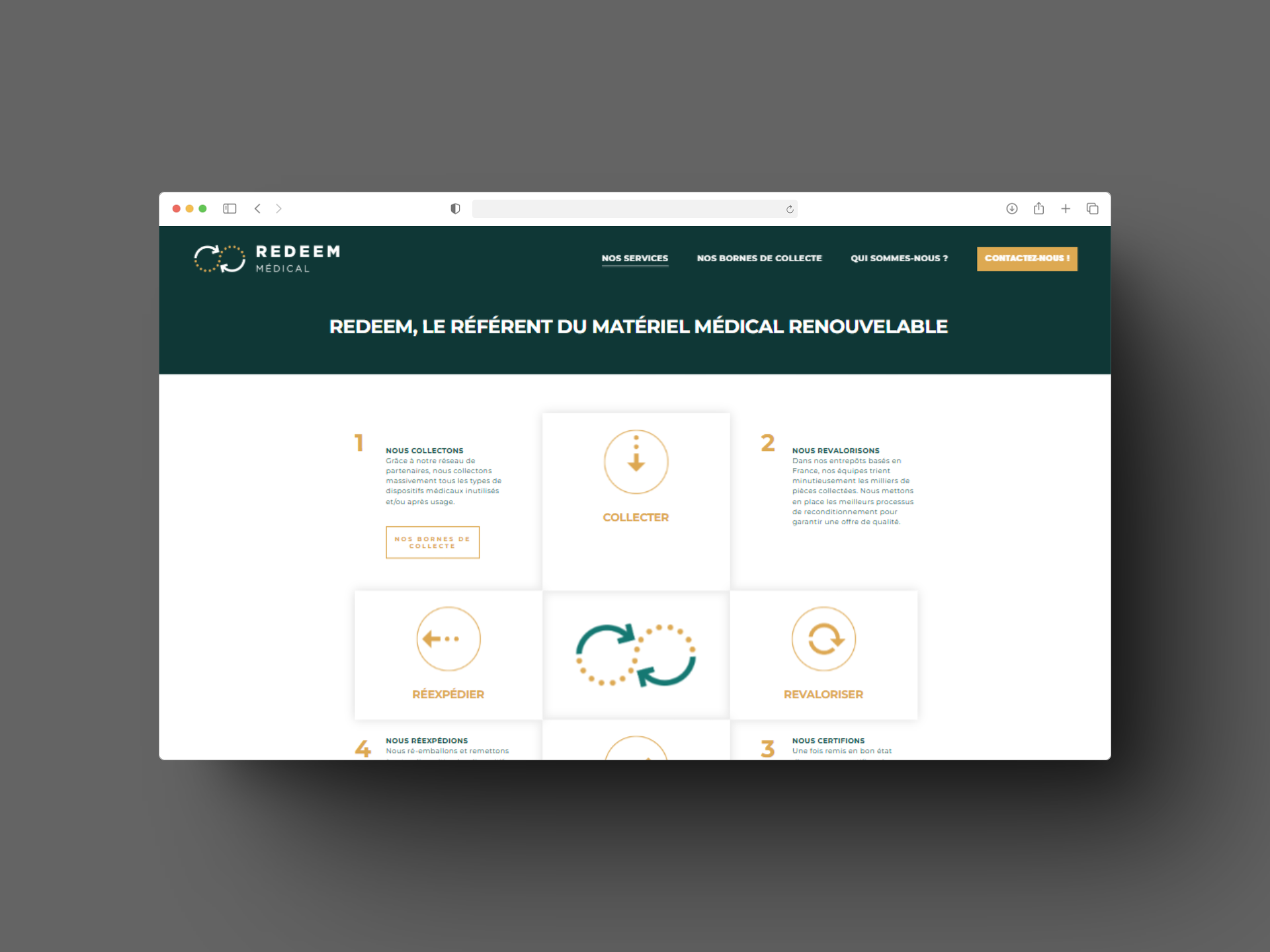
Website structure
Improvements :
1. Each page follows the : "Hook, Problem, Our solution, What you can do to join" structure
2. The Website is only for professionals to understand the project and join the collection network
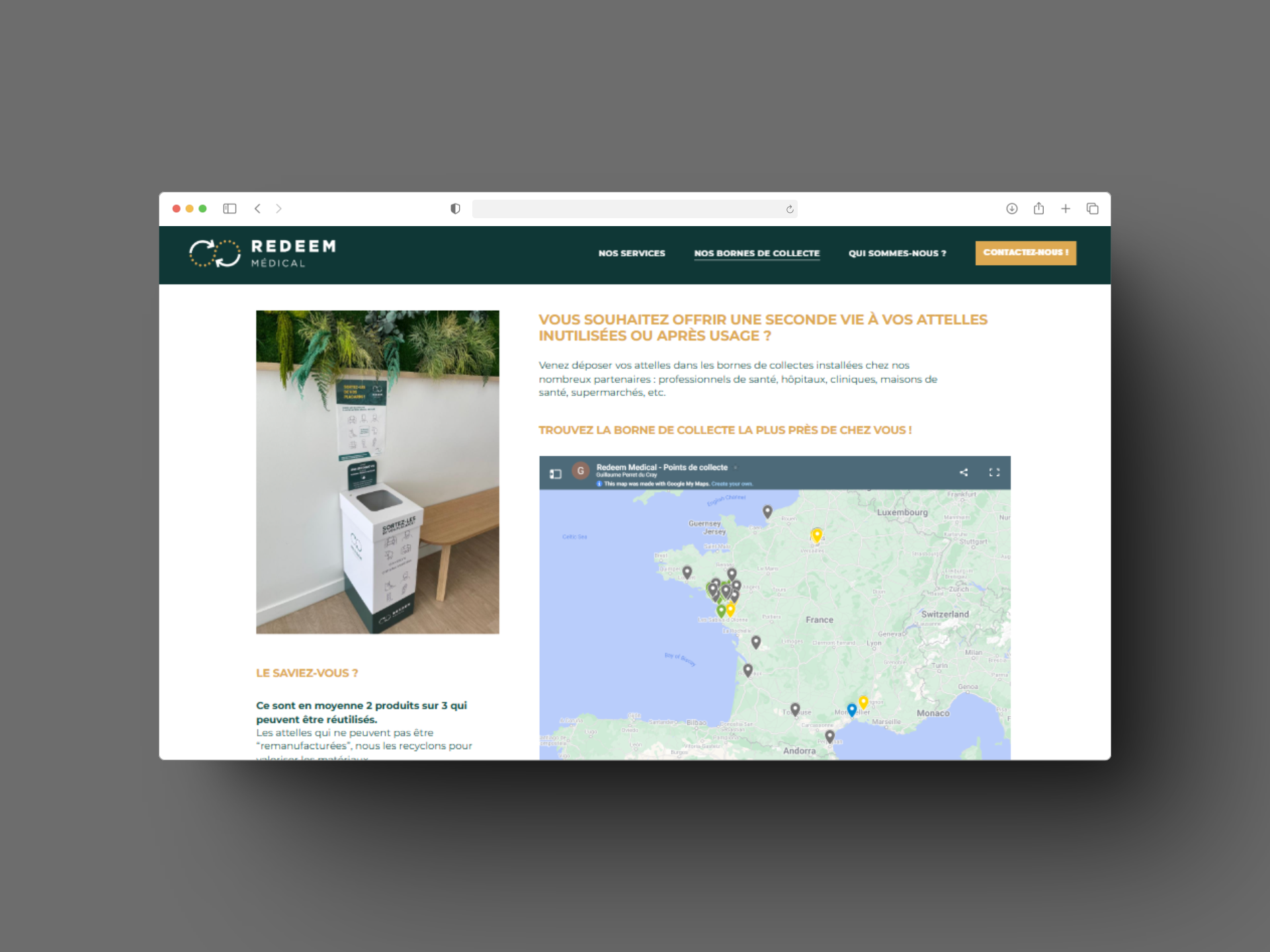
3. The collection points maps is a separate Landing Page dedicated only to individuals wanting to deposit their splints & co (can be seen from google searches, QR Codes in print products, social media)
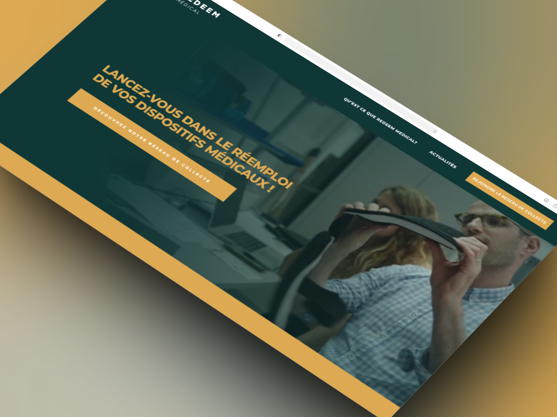
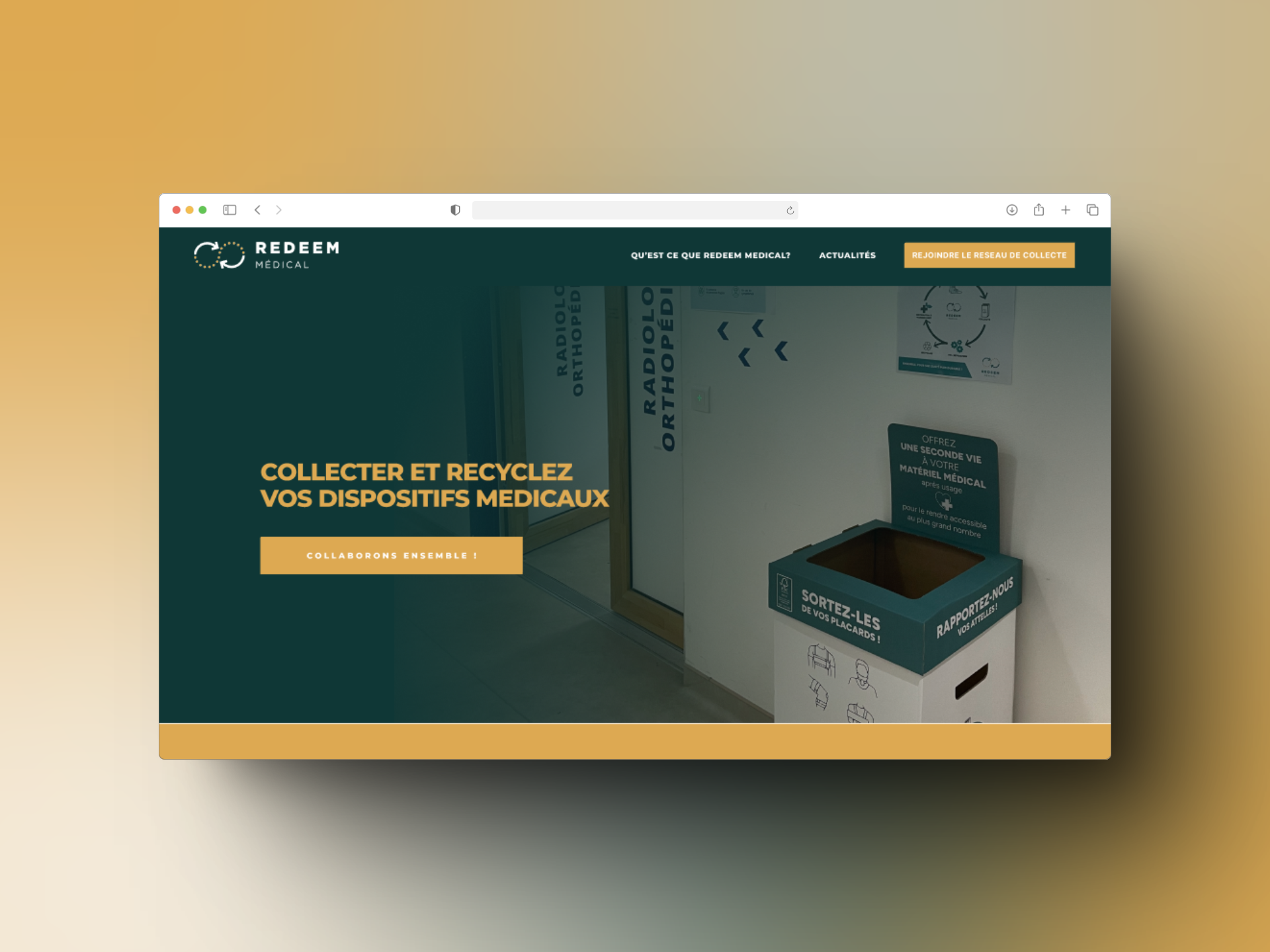
Home / Hero Section
Improvements :
1. Clear Call to actions shows what will happens once we click on it !
2. Shows what the company actually does and who does it
3. Allows to peak at the following sections and incites to scrolling
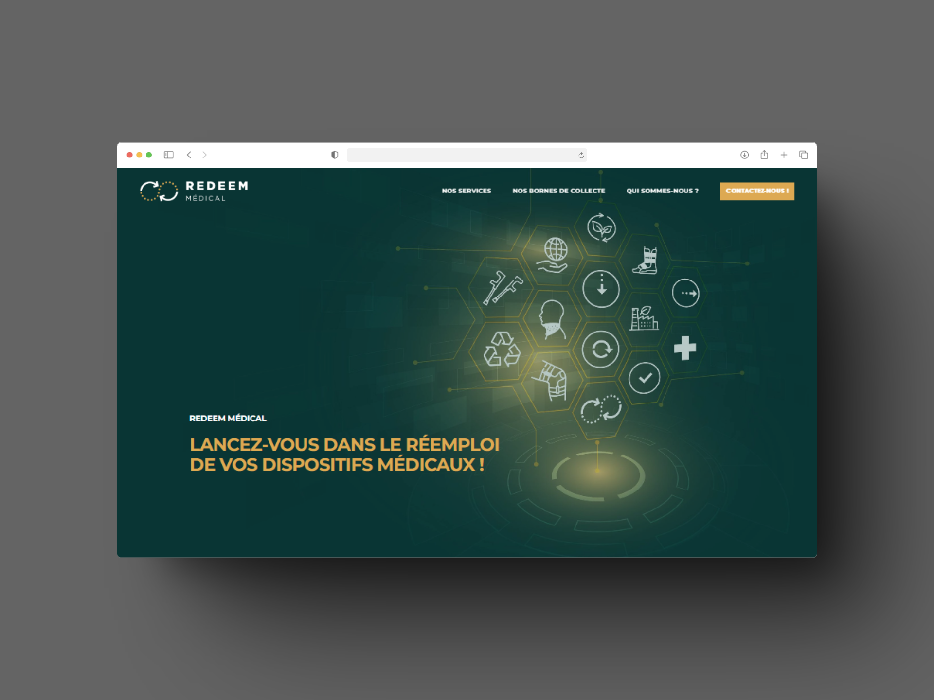

What is Redeem ?
Improvements :
1. Replaced a complex infographic with a more impactful video presentation
2. Grouped the team information with the company values and expertise (people first, business after !)

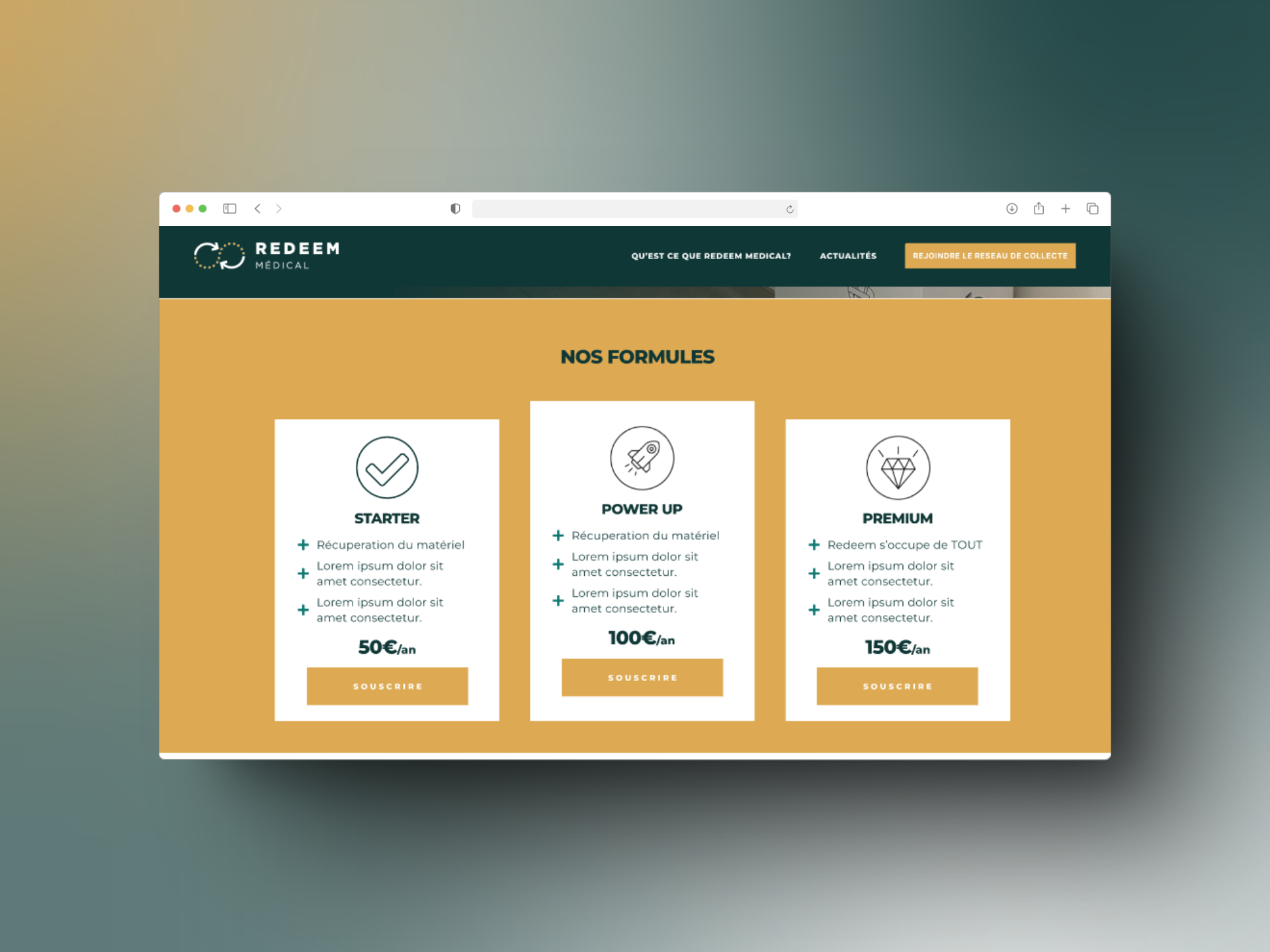
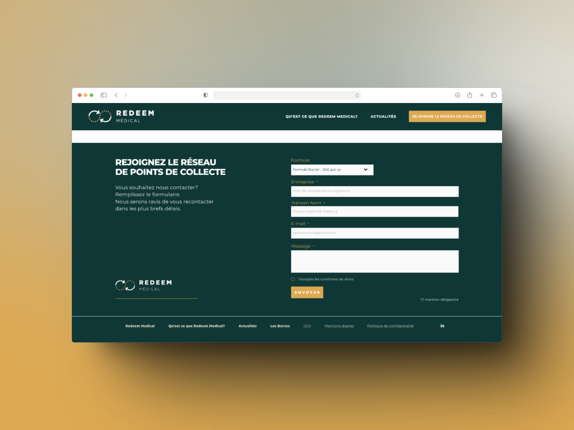
Joining the network
Improvements :
1. Shows what the collection points could look like
2. Present the subscription offers to be part of the project
3. Finishes with the form for the contact and subscription request (not an e-commerce with secure pay yet)
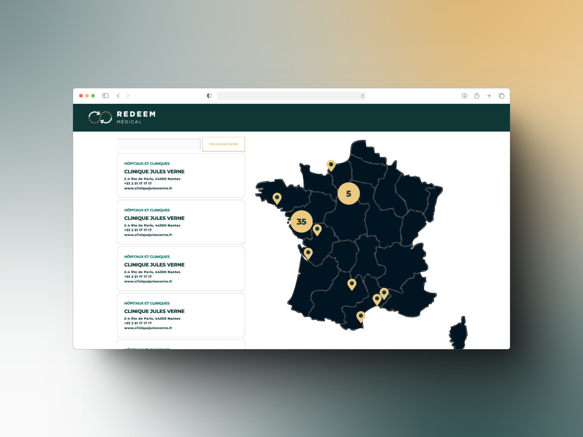
The Landing Page... especially the map
Improvements:
1. A clear list of possible points visible from the start
2. Grouping of close by locations for easier navigation and avoiding of information overload
3. followed by possible reasons and links to know more about the project
Thank you for looking at so many bullet points, hopefully you have beaten my record and read this in less than 2 days !
Want me to strip down and spit on your website too? Click down below
(No, I'm actually I kind and nervous feedback-er)