Last year I did a UX challenge nicknamed "Reading on the go" the result wasn't so bad but the objective of the project wasn't as clear on the final version.
So I… redid everything! Or almost.
I took the project back to the bare bones: the research and design guidelines. From which I recreated this new version. A new iteration backed up by my new experiences in the field.
What more I changed the project "back story", it isn't a context-less exercice but I imagined a newspapers company whose objective is giving quick information to a busy audience (a bit like 20minutes for the French folk ;)), the company needed a way to keep their subscriber engaged and shorten their user flow: no more daily log ins or waiting the paper versions at the bus stop. (sure there are a lot of people that don't like to read on their phones, so the paper version is still available to them)

Since I put the app business values on the front stage.
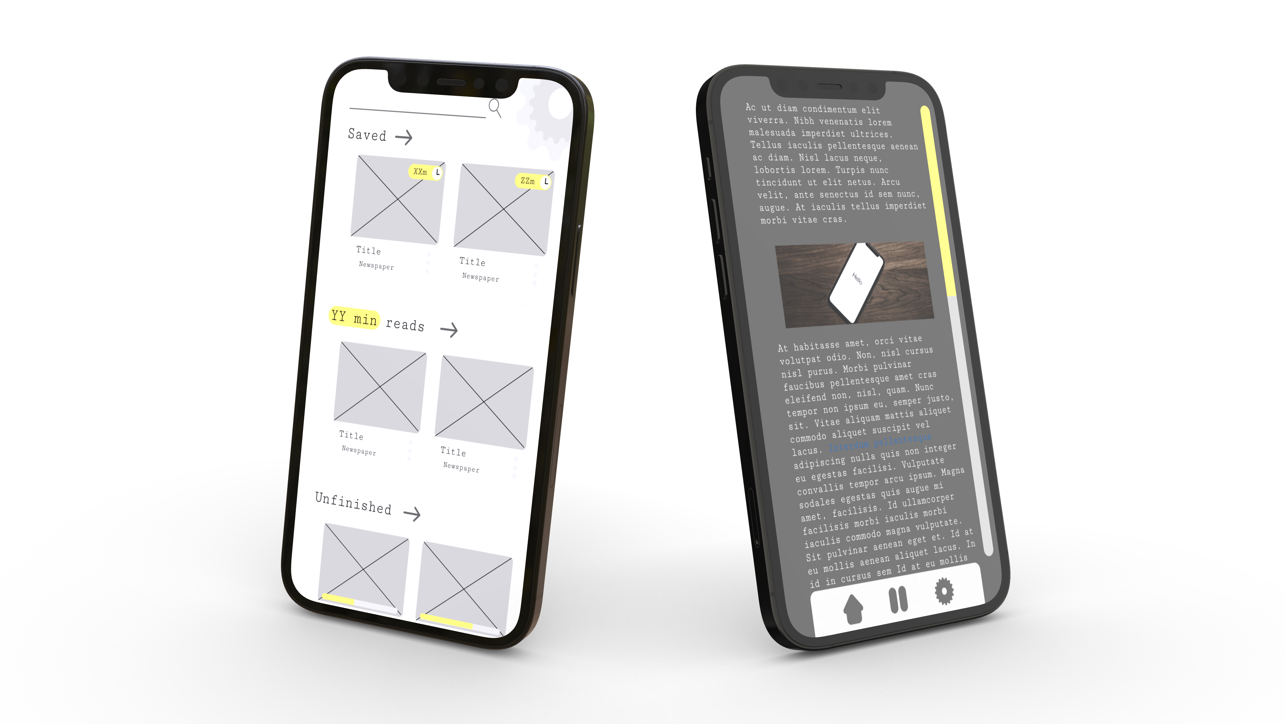
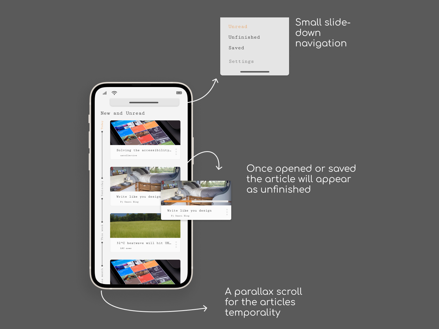
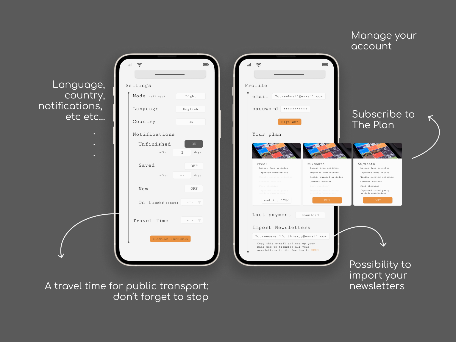
Here you have more functional app setting and a profile space (that wasn't in the first version).
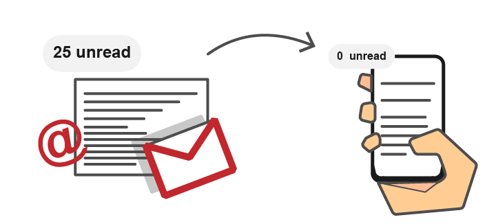
You can see that not only can we manage our personal data but now there are free and paid plans depending on the user needs (and financial wellbeing XP) that keep the main objective of a quick update on the worlds happening while adding on the business objectives. I also added (a bit last minute) a newsletters function, I've been receiving a lot of these but often forget to actually read them.
Prototype? <coming soon>