Reading articles on the go - “When we’re reading on the go, we often get interrupted by events such as the train arriving or social interactions with other people. Many interesting articles get abandoned or added to the ever growing “read later” list. How can you design an experience so readers can read effectively while on the go?” from: https://www.uxchallenge.co/
Project Overview
To solve this challenge, I focused on the time aspect of transits. Being an avid reader myself, I’m often confronted to the problem of short reads leaving with nothing to do for the rest of the ride, or long ones impossible to finish in one go.
In this solution each article has a calculated ‘reading time’, based on the reader reading speed, and a ‘progress’ showing where the reader last stopped and how much of the article is left. The number of articles one can save without starting is 20, I think that limiting them should help motivate users to reading them instead of letting their "to be read" list untouched.
The Problem(s)
1: timed transit
2: half-finished articles
3: infinite "to be read" list
UX Research / Personas
Mariline is a part time worker at multiple firms.
She doesn’t have a driving licence, so she needs to take the bus. Luckily, she lives in a small apartment at 15min from her first workplace.
She also doesn’t want to put aside money for a magazine subscription, so she read the news on her phone
Lucas lives with his family at 10km from his workplace, where he is a night shift employee.
Since he doesn’t want to drive in the dark, he’s been taking the bus and tram to go to work, which leaves him with an hour long route each day.
He doesn’t read much and if he does, it’s at home
Sketches Ideas and Wireframes

Second brainstorming session (the first one got lost?)
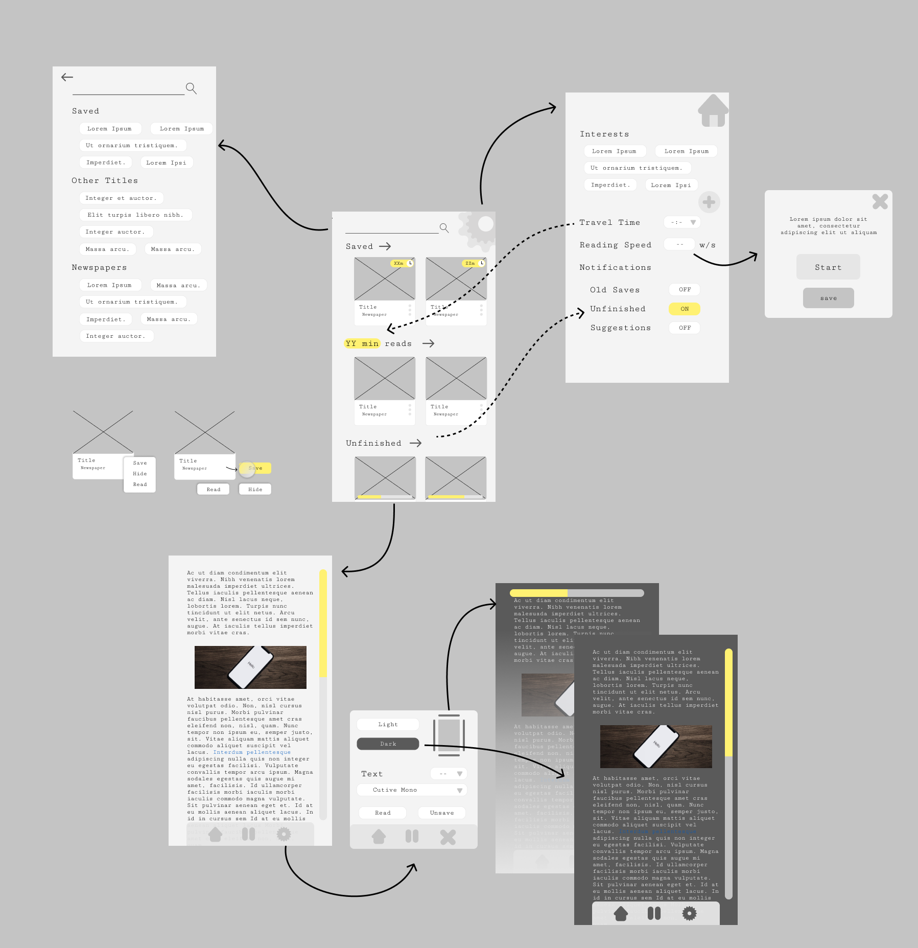
Site Map

During both the sketching and wireframing I found the biggest challenge to be the settings page.
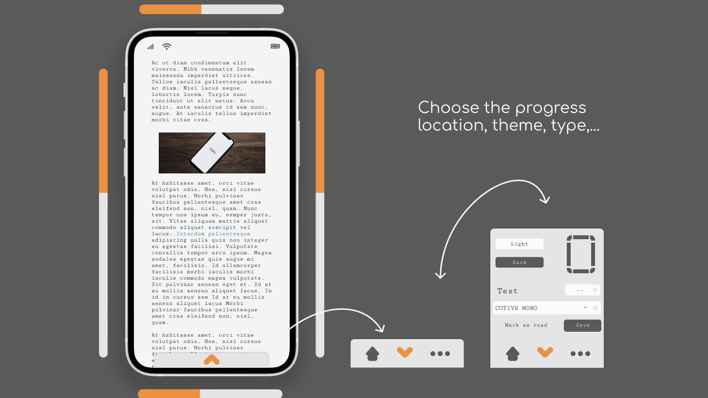
At first I thought of putting everything of them on the same page: the dark/light mode, fonts, progress bar settings on the same space as interests, times, notification settings... but this added additional steps to get to them from an article. If a user need to change a reading setting mid lecture he shouldn't go back to the homepage and then to the settings page and then back to the article!
Where I left off
I changed the article menu a bit, in the wireframe the middle 'pause' button didn't make a lot of sense for my users so I improvised and made a less invasive menu.
Possible improvement
Looking back, I think the options for each article card are a bit hard to open on a small screen, a possible solution is a click and drag menu (like Pinterest uses on each post)
Prototype
I don't feel like this project is finished (far from it even) but we all know: without motivation nothing gets done and having a full list of challenges to follow, I didn't feel like finishing this one, for now.
